Design Patents For Screens Just Got A Green Light: How Solo Inventors Can Lock In UI Protection Before Big Brands Pounce
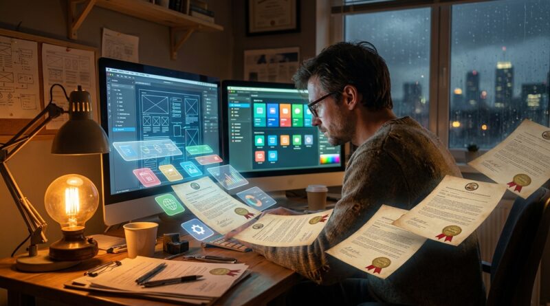
You spend weeks getting an app screen just right. The icon finally feels distinctive. The dashboard is clean, simple, and actually useful. Then someone tells you software patents are basically hopeless, so you assume the visual side of your product is fair game for bigger companies to copy. That is the part that stings. A lot of solo inventors are not trying to patent some hidden algorithm. They want to protect what users actually see and touch.
Here is the good news. The rules around design patent protection for user interfaces and app icons are getting friendlier, not tighter. The USPTO has been making it clearer that digital visuals, including on-screen layouts, icons, and similar interface elements, can fit into design patent practice when they are shown the right way. That does not mean every screen gets a patent. It does mean your best UI work may be far more protectable than you were led to believe. If you are about to launch, show at a trade event, or pitch investors, this is the moment to stop guessing and start filing with a plan.
⚡ In a Hurry? Key Takeaways
- Yes, design patent protection for user interfaces and app icons is becoming more practical, especially if you present the visuals clearly in proper patent drawings.
- Start by choosing the 2 or 3 screen views that make your product look unique, then file before launch or public release if possible.
- Do not assume copyright, trademarks, or “being first” will cover you. Design patents can give you a more direct tool against copycat visuals.
Why this matters now
Most founders hear “patent” and think of engines, medical devices, or some deep technical process. That is part of the problem. A lot of modern products win because the screen is the product. Think app home screens, watch interfaces, smart appliance controls, car dashboards, AR overlays, and wearable displays.
If that is where your invention lives, old patent advice can feel useless. You keep hearing that utility patents for software are hard, and that is often true. But design patents are a different lane. They focus on appearance, not function.
That distinction matters more than ever.
The USPTO has been opening the door wider for digital designs. If you want the broader background, Patentop recently covered it well in New USPTO Design Patent Rules Open the Door for UI, Icons and Holograms: What Indie Inventors Need To Do Now. The short version is simple. Screen-based inventions are not being brushed aside the way many indie creators still assume.
What a design patent actually protects
A design patent does not protect the code under the hood. It does not protect a general idea like “a settings menu with tabs” or “a shopping cart icon.” It protects the ornamental visual appearance shown in the patent drawings.
Think of it this way
If a utility patent is about how something works, a design patent is about how it looks.
For digital products, that can include:
- App icons
- Screen layouts
- Animated transitions in some cases
- Heads-up displays
- Wearable and IoT interface screens
- Portions of a display, not always the whole thing
This is why design patent protection for user interfaces and app icons is suddenly such a useful topic for solo inventors. The “look” may be the moat.
Why solo inventors miss this chance
There are three common reasons.
1. They think software and screen designs are the same thing
They are related, but not the same in patent law. Your app logic might be hard to patent as a utility invention. Your distinctive interface may still be worth filing as a design.
2. They wait until after launch
By then, screenshots are all over social media, beta testers have shared videos, and the filing window can get messy depending on what was disclosed and where.
3. They try to claim everything
This is a big one. A scattered filing with ten crowded screens is often weaker than a focused filing that shows the signature view cleanly.
How to choose the right screens to protect
If budget is tight, do not try to patent every page in your app. Start with the visuals that a customer would recognize instantly.
Ask yourself these questions
- Which screen would a competitor copy if they wanted to look like us fast?
- What part of the interface gets shown in demos, ads, or app store images?
- What visual arrangement feels most distinct from the rest of the market?
- Is the icon itself doing brand and product work at the same time?
For many solo teams, the best filing targets are:
- The home or dashboard screen
- A standout workflow screen
- The app icon or a key on-screen icon set
That “2 or 3 views” idea is often the sweet spot. It keeps costs more manageable and forces you to focus on the parts that matter most.
How to show a UI so an examiner understands it
This is where many good ideas fall apart. A design patent rises or falls on the drawings. If the images are sloppy, inconsistent, or overloaded, you make the examiner’s job harder and your protection weaker.
Use solid and broken lines correctly
In many design patent drawings, solid lines usually show what you are claiming. Broken lines often show environment or unclaimed parts. For a screen interface, that can be very useful. You may want to claim only the icon arrangement or only a particular panel, while showing the phone, tablet, or display boundary in broken lines.
Keep the views consistent
The same visual elements should appear the same way across views unless the design actually changes. If the spacing, shape, or proportions drift around from image to image, you invite objections.
Do not make the screen too busy
A real product screen can be cluttered. A patent drawing should be cleaner. You are not making a marketing mockup. You are defining the design.
Use proper titles and descriptions
Calling something “a screen display for a mobile application” is different from loosely describing it as software. The wording matters. A patent professional can help, but even at the planning stage you should think in terms of visual embodiments, not feature lists.
Timing matters more than most founders realize
If you are preparing a launch, this is the part to circle in red.
File before public release if you can. That includes:
- App store launch
- Public beta
- Trade show demo
- Kickstarter campaign
- Investor deck widely shared outside confidentiality
- Social media teaser with screenshots
People get tripped up because they think, “It is only a screen grab.” But a screen grab can still be a public disclosure. If the design is central to your value, get advice before you push it out into the world.
A practical filing timeline
- 6 to 8 weeks before launch: choose the key screen views and icon candidates
- 4 to 6 weeks before launch: prepare formal drawings and decide what to claim
- 2 to 4 weeks before launch: file, then finalize your marketing assets
That will not fit every startup sprint, of course. But even a basic timeline beats the usual approach, which is filing only after a bigger player has noticed your design.
Design patent vs copyright vs trademark
This is where non-lawyers get understandably confused. These rights can overlap, but they are not interchangeable.
Design patent
Protects the ornamental visual design as claimed in the patent drawings. Strong when a copycat product looks substantially similar.
Copyright
Can help with original artwork and some visual elements, but it is not a clean substitute for a design patent when the dispute is about product appearance.
Trademark or trade dress
Can protect source-identifying visuals, but usually takes time, market recognition, and proof that consumers link the look to your brand.
For a new indie product, a design patent can be the quickest clean line around a fresh interface look.
What big brands do that indies can copy
Big companies do not wait for certainty. They file around product launches, they break visuals into protectable pieces, and they build small fences instead of one giant wall.
You can do the same on a smaller budget.
File in layers
One filing might cover the app icon. Another might cover the main dashboard. Another might target a wearable display view. You do not need to do them all at once, but you should think in a sequence.
Protect the memorable part first
If users instantly recognize your circular stats wheel or your split-panel control screen, that is probably your first filing candidate.
Match filings to product roadmap
If version 2.0 will redesign the interface, do not spend all your money protecting a temporary look unless that look is what is shipping now and doing the heavy lifting.
Common mistakes that weaken UI design filings
- Using screenshots that were made for marketing instead of patent drawings made for legal clarity
- Changing the visual details after filing without thinking through what the filed design actually covers
- Claiming a whole device screen when only one portion is actually unique
- Waiting until after launch buzz attracts copycats
- Confusing function with ornament and writing the application around features instead of appearance
A simple playbook for a solo inventor
Step 1: Audit your product visually
Open your app, dashboard, or device interface and take note of the screens that feel unmistakably yours.
Step 2: Rank the top three
Pick the icon, the core screen, and the most visually distinct workflow or state.
Step 3: Check what is already out there
Do a practical market scan. Look at competitors, app stores, product videos, and published design patents if you can.
Step 4: Prepare clean drawings
This is not the place to cut corners. A good draftsperson or patent professional can save you from a lot of avoidable pain.
Step 5: File before noise starts
Once marketing starts, your options can narrow fast.
Step 6: Keep a version history
If your UI changes every month, track major design shifts. That helps you decide whether to file additional applications later.
At a Glance: Comparison
| Feature/Aspect | Details | Verdict |
|---|---|---|
| Best filing target | The screen view or app icon users recognize fastest, especially the one shown in demos and app store listings | Start here first |
| When to file | Ideally before public launch, beta release, trade show display, or widely shared screenshots | Earlier is safer |
| What makes the filing strong | Clear drawings, focused claims, consistent views, and careful use of claimed versus unclaimed portions | Clarity beats complexity |
Conclusion
If you have been treating your interface as “just polish,” it may be time to rethink that. For a lot of indie inventors, the most original part of the product is not hidden in the code. It is right there on the screen. This helps the Patentop community today because design protection for digital products is having a quiet rule change moment, and most indie founders and garage inventors have not caught up. While headlines fixate on AI and quantum filings, the USPTO is explicitly widening the path for design patents on icons, interfaces and other on-screen elements, which is exactly where many solo inventors actually innovate. If you can pick the two or three screen views that matter, sketch them in a way an examiner understands, and file around upcoming launches, you can turn what felt like unprotectable UX polish into real, enforceable IP. That is a concrete step forward for anyone building apps, IoT dashboards, or embedded interfaces who thought patents were only for chips and chemicals.